Posts

graphic final

Image
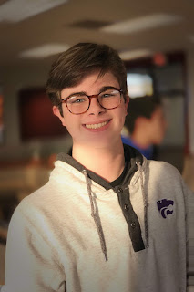
T he scope of this project was to create either a vector or organic vector image of a normal image.This project took me about three weeks to finish completely. The biggest challenge I faced was creating the eyes. I couldn't get them to pop and the picture I used cropped out my eye lids a good portion. I learned a lot about the curved pen tool. it is very useful and I use it all the time.I took a lot of council from my peers for the background and they helped a lot with my eye dilemma.  I didn't really change my idea over time . I kept it pretty much the same. I knew I wanted the organic model and I wanted to use my self. I think this is very good except for the eyes, didn't have much I could've done with them so I took what I could.  The scope of this project was to create a personal log that could be used as a trade mark to make our work ours. Th is project from preproduction and finished product took about 2 weeks. T he only challenge I faced...

My final words

 I learned a lot about to use audio programs and problem solve when actors back out and then we go on an endless search to find an actor to fit out artistic vision i will spend less time in preproduction and get everything done quick and get actors who are very committed to the role and are very  available   and won’t be sidetracked by other commitments, 

Movie trailer

Image
The scope of the project was to recreate a movie trailer that is as close to the original as possible. Our process started with a lot of story boarding and talking about how we wanted to show the video with the highest obtainiable accuracy. It took a lot of filming and we had to use A lot of improvisation because of  alot of putting stuff off but we got through it. I learned that I hate storyboarding and that it takes a lot of time and thought to create a decent movie trailer and preproduction is terrible I learned a lot about how to Get around using premier becauee I had time constraints and was rushed with the editing process in general but I learned a lot about to be a team player and improvise I stayed with my project time and I got mine finished in time. But I learned a lot about how to communicate and how to make the most amount of the time we had I would use my class time in class better and more effectively and I would have used more time editing and getting a b...

blog two

Image
i wanted something that I could edit and use the organic style of vector images. posterizing the image was difficult because to get a good one would've been right in-between two selections. there wasn't much prepping for. anything in illustrator.   I wanted something that I knew how it looked and how to keep it the closest to original as possible, and I recently had this picture taken and I liked the way it turned out.  I learned lot more about the curved pen tool and its uses How were you able to problem solve? I used a lot of readjusting the layers and the individual crops. I asked for advice from neighbors or my teacher.  I focused a lot on shape and value in this piece. I wanted the parts that are important features in my face to show in the picture.  I am pretty pleased with the final product, it could be a lot better but I am pleased.  I would give my eyes and my eye lids more detail and just greater detail throughout. 

blog one

Image
I had a good amount of time to find good and meaningful quotes and don’t to mirror the feel of the quotes. I learned alot about how to use the curved pen tool and how to adjust your lines and I learned alot about how to make lines smooth and flow the lines with more accuracy.  I moved the words around enough to make them different than just copy pasting them. I wanted the word style to match they lay they were layed out. Oh it added a whole different layer to the challenge. Instead of just getting the words layed out you had to pic matching colors and matching everyother aspect of it. I prefer black and white because it looks simple and not as much about finding matching colors. I think the final product was better than I imagined it to come out, I thought they would be dull being black and white but they made them seem more professional. I would have used my time better but I was pretty satisfied with the result.

Music video

the scope of the project was to recreate a music video that is as close to the original as possible. Our process started with a lot of story boarding and talking about how we wanted to show the video with the highest obtainiable accuracy. It took a lot of filming and we had to use A lot of improvisation because of weather complications but we got through it. Well we had an editing party so that was fun, and we got all of our editing finished in that time. I learned that I hate storyboarding and that it takes a lot of time and thought to create a music video I learned a lot about how to edit Audio and how to slow down footage and speed it up and editing it overall. I stayed with my project time and I got mine finished in time. But I learned a lot about how to communicate and how to make the most amount of the time we had I would use my class time in class better and more effectively and I would have used more time editing and getting a better edit because I felt a little rushe...

final.

Image
 I have done like 10 different projects this semester. I did stuff from a raccoon to a pop art graphic. https://www.behance.net/growneydyl7d5f 
the project was to follow a step by step process to make a cute little raccoon It took me between one and two weeks. 
 
I was challenged with trying to keep focused and getting it done on time.  
I learned a lot about how to keep focused and how to use many shapes to make one piece of art.  
I got a lot of good feedback and a lot about the eyes and the feet. 
no not really it was just aloof of copying and and making it look like the original pics. this one got me a lot of good opinions and good feedback.  
 I didn't focus a lot in this class but I'm focusing more. The project was to creation info graphic based on an idea of our choice. 
This took me like 3 weeks total to complete. 
I was challenged all with fonts and which kind of graphic store use for the back rounds. This was the first tim...

Video project

Image
The scope of this project was to go deeper into someones past and their daily life and create a feature story about that. I shot a lot of b-roll and a lot of interview recording. we ha Dalit of ideas of things we could of interviewed her on so we desired on her passion for video games and how they've affected throughout her life. I learned about how to deal with camera and mic problems. I learned how to make a audio clip louder in premier pro. I learned a lot about Alexis and her past and a lot about deadlines and how its more important to turn something bad in vs being late. I would've focused in the first couple days vs relaxing and working on it later, whochif I would've gotten working faster I would've finished faster and had a better project. I wouldnt do a lot of the same because this wasn't my best work and it could be so much better. I will have a better voice over rand better editing strategies.

printing process

Image
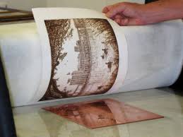
relief process: you take a object to apply even pressure throughout the piece of paper. Paper is put over a precut wood block, and pressure is applied that will leave marks on the paper. most commonly on wood. intaglio process:drypoint, you take etching tools to scratch metal to make textures or designs. etching, polishing and cleaning first to make it look perfect. you scotch away at paint or primer to remove paint to show underlying copper.  lithography process: drawing with stone. stone printing and is based off of grease and water. higher number equals harder material. 

panaroma project

Image
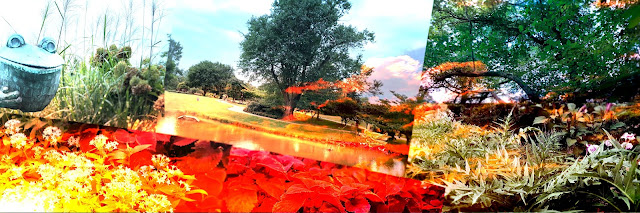
           it all started with me walking through the woods. i was planing on walking and just being in thought, as I was walking all I could think about was the smell of the flowers and the beautiful scenery. then out of the corner of my eye I saw something move in the tall grass. I was on the edge of either running away or to investigate.           I decided to investigate and the closer I got to the tall grass the faster my heart pumped. I must of reached a heart beat of 160 bpm at one point. I got really close and called out to see if something moved or yelled back, nothing did. I was incredibly worried and anxious while walking up. I pushed my self and shoved the grass away and all there was laying there was a rabbit. "all that because of a rabbit" I kept repeating.  as walking back home I saw a statue of a frog and...

pop art

Image
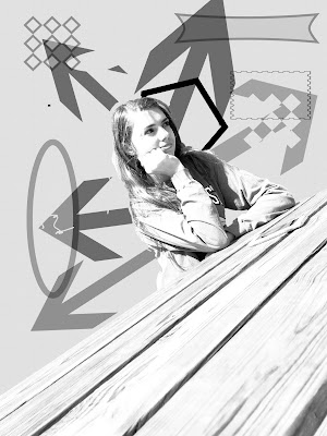
I used a lot of different layers and masks to achieve the final product. I started by the idea of having her be the main focus and have like an explosion of shapes coming out from her. I made sure to make her stand out and not have her fall into the background. I chose a black and white color scheme to make it look simple but still bold. I didn't really have any inspiration I just went off of what I thought pop art looked like. I used alot of layer masks and a lot of shapes and filters.

nature man

Image
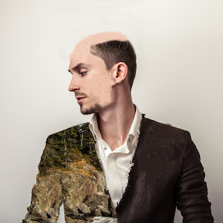
the scope of the project was to take a picture of man with a white background and to incorporate a picture of nature into his jacket or his hair or something of that matter. the only kind of preproduction that I did was to look at others projects and see what I liked and what I didn't like. I learned a lot about how to incorporate photo masks. and I messed with the quick select tool and learned that its more useful to have a smaller selection. I only used photoshop but I incorporated a lot of the aspects of photoshop. I made my deadline but int was a solo project but I did get advice and help from peers around me.  Next time I would have put more time into his hair. it isn't the cleanest it could be. I would have just spent more time on everything else. I just ran out of time and it could've been a lot cleaner and sharper edges. Next time I have project I will defiantly incorporate layer masks and use more of the patch and quick selection tools.  I enjoyed t...

photoshop lesson #1

Image
our scope was to lean about and how to incorporate all of the functions needed in the graphic design world. there was not a lot of pre-producition work but we did have to copy and paste our own folder off of the server.I learned a lot about layer masks and how they function. I learned how the quick select tool works and a lot about how many other functions and tools work in photoshop. we used a lot of photoshop. I never knew how many functions you can utilize in a simple design. o Professionally (Collaboration, Teamwork, Project Deadlines) I took me longer than I wanted to take on the later projects than I wanted to take. I would have focused more and put more thought in the minor things. I would do do all the  but just focus more. I will defiantly remember to use layer masks and some of that jazz

final blog post

Image
       Our product was the Stretch TV. it was a TV that could shrink or grow to any size. it took us to the last minute and our product would have been a lot better if we had more time. our only challenge was trying to stay on task and trying to get it don't in the time frame. we didn't receive negative feedback, but we didn't get much feedback anyway. we had many changes along the way, we changed our website 3 times and changed graphics many times. I am disappointed with my work. I didn't focus the whole time and I could have contributed more to the final product. my team members put in 110% towards the final product. I worked only in class. Katie stayed after school one time but most of the work was done during class time. after we would finish a graphic or an ad we would work on other homework for the rest of the hour but the next day we would come in and get started on the next thing. we would communicate with each other with ideas or if someone fin...

Quarter 3 web project

Image
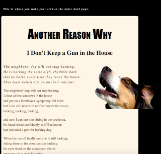
. Contrast: used brown, black, and tan to contrast each other. the dog being a mix of all of the colors adds to the contrast. Alignment: I aligned the text with the other texts and the title and sub-title are aligned with each other, and I contrasted the text with the dog. Repetition: I aligned the text with other texts to make the repetition in the page work and glide smoothly. Proximity: I spaced everything enough where it didn't look like it was a big paragraph and to here it wasn't too spaced out. 

personality

Image
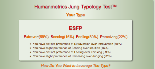
ESFP  My Meyer-briggs personality type is ESFP. which means I love people, excitement, telling stories and having fun. I also enjoy helping people who need help for something that I know how to help with.  I was assigned an otter for the second personality test. The scope of the project was to find out what personality we are. I learned that  Meyer-briggs is a test and not a company. I liked tom learn about my personality, I had non idea that I had the same personality as Jamie Foxx, Marylin Monroe, and Pablo Picasso.

sketchup house

Image
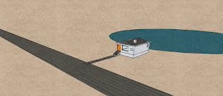
            I attempted to do a bigger house that was very similar to a duplex. it had a two car split garage and after many attempts to create the basics of the house and I eventually was forced to switch designs. I switched to a simpler house but due to many complications  and the due date of the project I had to change designs again. I switched to a very simple homes but to combat the simpleness I put in a road and a lake behind the house. I added two textures off of the internet. I added a road texture because I didn't have time to go in and make all of the lane markings, a texture to have as the rising for the sides of my house, and I also added a bamboo texture to work with the dock. in this project we were supposed to create a house.

bouncing ball

Image
the scope of this project was to utilize our abilities to use photoshop to make a ball bounce. the process included a short power point on photoshop and how to utilize all of photoshops tools, we made a simple ball that is bouncing up and down with now horizontal movement. then we moved into having he ball bounce across the screen. after those minor projects we had two use our creative mind to make the ball do something . I made my ball bounce across most of the screen and towards the end of the screen and then the ball expands and poops like a balloon . I learned a lot about photoshop and what the gif and png means on an export standpoint. if its to do something different I would have have made the ball do something more interesting rather than having the ball just pop. I will use my new ability to change brush size and brush texture into other projects. I liked learning about how photo shop is used and how to change a lot of the settings to my favor.

web final

Image
I started with the frame for my website from the server. I wanted to go with a simple but attracting design. I feel I have accomplished my design. I accidentally put all off my projects in the website and I didn't have time to erase them.

elevator pitch

My name is Dylan Growney. I am 14 years old.I am currently enrolled in e-communication at Olathe Northwest high school.  I was born in olathe Kansas. I am very interested in graphic design, and animation. I went to woodland elementary, Santa Dr trail middle school, and olathe north west high school.I am funny, hard-working, and a team player. I love to work in groups. I have always been a people person. I will work late hours and work until my job is done. I love music, I grew up with parents that loved music and they passed that gift onto me.  I play the french horn and i am in the concert band at olathe north west. I strive to be on time as much as possible. I am very WOO. i am a very good problem solver. If i see a problem i try to fix it.