Posts

bouncing ball

Image
the scope of this project was to utilize our abilities to use photoshop to make a ball bounce. the process included a short power point on photoshop and how to utilize all of photoshops tools, we made a simple ball that is bouncing up and down with now horizontal movement. then we moved into having he ball bounce across the screen. after those minor projects we had two use our creative mind to make the ball do something . I made my ball bounce across most of the screen and towards the end of the screen and then the ball expands and poops like a balloon . I learned a lot about photoshop and what the gif and png means on an export standpoint. if its to do something different I would have have made the ball do something more interesting rather than having the ball just pop. I will use my new ability to change brush size and brush texture into other projects. I liked learning about how photo shop is used and how to change a lot of the settings to my favor.
web final

Image
I started with the frame for my website from the server. I wanted to go with a simple but attracting design. I feel I have accomplished my design. I accidentally put all off my projects in the website and I didn't have time to erase them.

elevator pitch

My name is Dylan Growney. I am 14 years old.I am currently enrolled in e-communication at Olathe Northwest high school.  I was born in olathe Kansas. I am very interested in graphic design, and animation. I went to woodland elementary, Santa Dr trail middle school, and olathe north west high school.I am funny, hard-working, and a team player. I love to work in groups. I have always been a people person. I will work late hours and work until my job is done. I love music, I grew up with parents that loved music and they passed that gift onto me.  I play the french horn and i am in the concert band at olathe north west. I strive to be on time as much as possible. I am very WOO. i am a very good problem solver. If i see a problem i try to fix it.

my logo

Image
1st step: I started with drawing a pair of glasses and some hair to have a fore head as the white space. I was going to use the arch tool but as I shrunk the logo the thickness stayed the same. my idea wasn't working well so I changed up the logo. 2nd step: I chose to utilize the shield and the star in my logo. I wanted to use my initials in my logo as well. I had stars using a semi-3D star design. 3rd step: for the third step was to add color. I took inspiration from some of the Olathe middle schools. I used SFT, MT, CT, P RT.

oz poster

Image
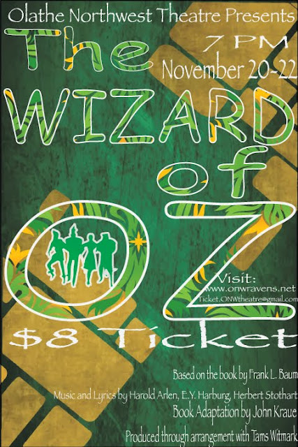
contrast:  I used white to outline my letter to make them stand out from the background. I used a lot of white for my letters. tried to use colors that stand out in a green and yellow background.  Alignment: I tried to align the parts about the creators on the bottom, to align them with the right. I aligned the time and date with the end of wizard.  repetition: I used comic sans for the title. I used papyrus font for all of the smaller words.  proximity:  I grouped the date, time, and location together. I also grouped the websites and emails together. 

typeface project

Image
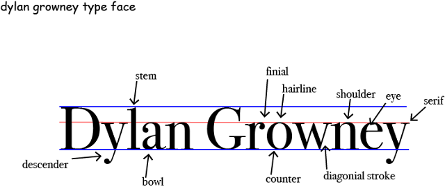
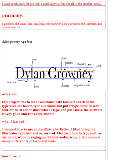
overview: this project was to make our name with labels for each of the typefaces. we had to type our name and put retype name in serif font. we used adobe illustrator to type and put labels. the software is very good and runs very smooth. what I learned: I learned how to use adobe illustrator better. I liked using the illustrator type tool and arrow tool. I learned how to type and use my name, while changing up the font and spacing. I also learned many different type faces and fonts.  how it went:  this project went very well. I worked very hard to finish this project. I tried to make the font and the lines and labels line up as much as possible. 

color scemes of logos

Image
Gatorade used the complementary colors of orange, and green. they chose these colors mean luck and creative. Mountain Dew used the complementary colors of red and green. they used these colors mean power and luck. YMCA used the analogous colors of blue and purple. they used these colors because they mean imagination and life. Sprite used the analogous colors of blue and green. they used these colors because they mean luck and life. the Vancouver Whitecaps used the cool colors of blue, white, and navy. they used these colors because they mean calm, life, and loyalty. Sporting KC used the cool colors of clue, gray, and light blue. they used these colors because they mean loyalty and elegance BAPE used the monochromatic colors of Brown and light brown. they used these colors because they mean stability and structure.  Animal Planet used the mono aromatic colors of green, light green, and dark green. they used these colors. because they mean luck and life...