Posts

Showing posts from November, 2017

oz poster

Image
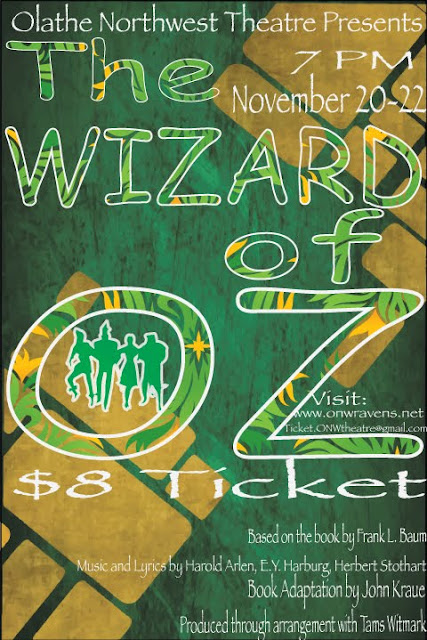
contrast:  I used white to outline my letter to make them stand out from the background. I used a lot of white for my letters. tried to use colors that stand out in a green and yellow background.  Alignment: I tried to align the parts about the creators on the bottom, to align them with the right. I aligned the time and date with the end of wizard.  repetition: I used comic sans for the title. I used papyrus font for all of the smaller words.  proximity:  I grouped the date, time, and location together. I also grouped the websites and emails together. 

typeface project

Image
overview: this project was to make our name with labels for each of the typefaces. we had to type our name and put retype name in serif font. we used adobe illustrator to type and put labels. the software is very good and runs very smooth. what I learned: I learned how to use adobe illustrator better. I liked using the illustrator type tool and arrow tool. I learned how to type and use my name, while changing up the font and spacing. I also learned many different type faces and fonts.  how it went:  this project went very well. I worked very hard to finish this project. I tried to make the font and the lines and labels line up as much as possible. 

color scemes of logos

Image
Gatorade used the complementary colors of orange, and green. they chose these colors mean luck and creative. Mountain Dew used the complementary colors of red and green. they used these colors mean power and luck. YMCA used the analogous colors of blue and purple. they used these colors because they mean imagination and life. Sprite used the analogous colors of blue and green. they used these colors because they mean luck and life. the Vancouver Whitecaps used the cool colors of blue, white, and navy. they used these colors because they mean calm, life, and loyalty. Sporting KC used the cool colors of clue, gray, and light blue. they used these colors because they mean loyalty and elegance BAPE used the monochromatic colors of Brown and light brown. they used these colors because they mean stability and structure.  Animal Planet used the mono aromatic colors of green, light green, and dark green. they used these colors. because they mean luck and life.

chase scene

https://drive.google.com/open?id=0B1wyaty5yQHtaTRQWjVZWHRmNjA&authuser=1           me and my group didn't have any problem coming up with ideas. we are all very creative and only cam up with ideas that were possible. We combined all of our ideas to make a big idea.we only scouted for one day while we were still deciding our final idea. we went outside and talked with the office to make sure it was ok to fit outside. we had two actors and two cameraman. we all want to do what we wanted to do so there was no argument on what job to do. my film editing skills have increased a lot in premier scene the start of the class.