Posts

Quarter 3 web project
Image
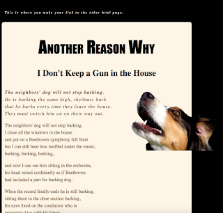
. Contrast: used brown, black, and tan to contrast each other. the dog being a mix of all of the colors adds to the contrast. Alignment: I aligned the text with the other texts and the title and sub-title are aligned with each other, and I contrasted the text with the dog. Repetition: I aligned the text with other texts to make the repetition in the page work and glide smoothly. Proximity: I spaced everything enough where it didn't look like it was a big paragraph and to here it wasn't too spaced out. 
personality

Image
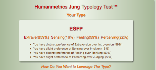
ESFP  My Meyer-briggs personality type is ESFP. which means I love people, excitement, telling stories and having fun. I also enjoy helping people who need help for something that I know how to help with.  I was assigned an otter for the second personality test. The scope of the project was to find out what personality we are. I learned that  Meyer-briggs is a test and not a company. I liked tom learn about my personality, I had non idea that I had the same personality as Jamie Foxx, Marylin Monroe, and Pablo Picasso.

sketchup house

Image
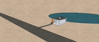
            I attempted to do a bigger house that was very similar to a duplex. it had a two car split garage and after many attempts to create the basics of the house and I eventually was forced to switch designs. I switched to a simpler house but due to many complications  and the due date of the project I had to change designs again. I switched to a very simple homes but to combat the simpleness I put in a road and a lake behind the house. I added two textures off of the internet. I added a road texture because I didn't have time to go in and make all of the lane markings, a texture to have as the rising for the sides of my house, and I also added a bamboo texture to work with the dock. in this project we were supposed to create a house.

bouncing ball

Image
the scope of this project was to utilize our abilities to use photoshop to make a ball bounce. the process included a short power point on photoshop and how to utilize all of photoshops tools, we made a simple ball that is bouncing up and down with now horizontal movement. then we moved into having he ball bounce across the screen. after those minor projects we had two use our creative mind to make the ball do something . I made my ball bounce across most of the screen and towards the end of the screen and then the ball expands and poops like a balloon . I learned a lot about photoshop and what the gif and png means on an export standpoint. if its to do something different I would have have made the ball do something more interesting rather than having the ball just pop. I will use my new ability to change brush size and brush texture into other projects. I liked learning about how photo shop is used and how to change a lot of the settings to my favor.

web final

Image
I started with the frame for my website from the server. I wanted to go with a simple but attracting design. I feel I have accomplished my design. I accidentally put all off my projects in the website and I didn't have time to erase them.

elevator pitch

My name is Dylan Growney. I am 14 years old.I am currently enrolled in e-communication at Olathe Northwest high school.  I was born in olathe Kansas. I am very interested in graphic design, and animation. I went to woodland elementary, Santa Dr trail middle school, and olathe north west high school.I am funny, hard-working, and a team player. I love to work in groups. I have always been a people person. I will work late hours and work until my job is done. I love music, I grew up with parents that loved music and they passed that gift onto me.  I play the french horn and i am in the concert band at olathe north west. I strive to be on time as much as possible. I am very WOO. i am a very good problem solver. If i see a problem i try to fix it.

my logo

Image
1st step: I started with drawing a pair of glasses and some hair to have a fore head as the white space. I was going to use the arch tool but as I shrunk the logo the thickness stayed the same. my idea wasn't working well so I changed up the logo. 2nd step: I chose to utilize the shield and the star in my logo. I wanted to use my initials in my logo as well. I had stars using a semi-3D star design. 3rd step: for the third step was to add color. I took inspiration from some of the Olathe middle schools. I used SFT, MT, CT, P RT.