Posts

printing process

Image
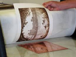
relief process: you take a object to apply even pressure throughout the piece of paper. Paper is put over a precut wood block, and pressure is applied that will leave marks on the paper. most commonly on wood. intaglio process:drypoint, you take etching tools to scratch metal to make textures or designs. etching, polishing and cleaning first to make it look perfect. you scotch away at paint or primer to remove paint to show underlying copper.  lithography process: drawing with stone. stone printing and is based off of grease and water. higher number equals harder material. 

panaroma project

Image
           it all started with me walking through the woods. i was planing on walking and just being in thought, as I was walking all I could think about was the smell of the flowers and the beautiful scenery. then out of the corner of my eye I saw something move in the tall grass. I was on the edge of either running away or to investigate.           I decided to investigate and the closer I got to the tall grass the faster my heart pumped. I must of reached a heart beat of 160 bpm at one point. I got really close and called out to see if something moved or yelled back, nothing did. I was incredibly worried and anxious while walking up. I pushed my self and shoved the grass away and all there was laying there was a rabbit. "all that because of a rabbit" I kept repeating.  as walking back home I saw a statue of a frog and...

pop art

Image
I used a lot of different layers and masks to achieve the final product. I started by the idea of having her be the main focus and have like an explosion of shapes coming out from her. I made sure to make her stand out and not have her fall into the background. I chose a black and white color scheme to make it look simple but still bold. I didn't really have any inspiration I just went off of what I thought pop art looked like. I used alot of layer masks and a lot of shapes and filters.

nature man

Image
the scope of the project was to take a picture of man with a white background and to incorporate a picture of nature into his jacket or his hair or something of that matter. the only kind of preproduction that I did was to look at others projects and see what I liked and what I didn't like. I learned a lot about how to incorporate photo masks. and I messed with the quick select tool and learned that its more useful to have a smaller selection. I only used photoshop but I incorporated a lot of the aspects of photoshop. I made my deadline but int was a solo project but I did get advice and help from peers around me.  Next time I would have put more time into his hair. it isn't the cleanest it could be. I would have just spent more time on everything else. I just ran out of time and it could've been a lot cleaner and sharper edges. Next time I have project I will defiantly incorporate layer masks and use more of the patch and quick selection tools.  I enjoyed t...

photoshop lesson #1

Image
our scope was to lean about and how to incorporate all of the functions needed in the graphic design world. there was not a lot of pre-producition work but we did have to copy and paste our own folder off of the server.I learned a lot about layer masks and how they function. I learned how the quick select tool works and a lot about how many other functions and tools work in photoshop. we used a lot of photoshop. I never knew how many functions you can utilize in a simple design. o Professionally (Collaboration, Teamwork, Project Deadlines) I took me longer than I wanted to take on the later projects than I wanted to take. I would have focused more and put more thought in the minor things. I would do do all the  but just focus more. I will defiantly remember to use layer masks and some of that jazz

final blog post

Image
       Our product was the Stretch TV. it was a TV that could shrink or grow to any size. it took us to the last minute and our product would have been a lot better if we had more time. our only challenge was trying to stay on task and trying to get it don't in the time frame. we didn't receive negative feedback, but we didn't get much feedback anyway. we had many changes along the way, we changed our website 3 times and changed graphics many times. I am disappointed with my work. I didn't focus the whole time and I could have contributed more to the final product. my team members put in 110% towards the final product. I worked only in class. Katie stayed after school one time but most of the work was done during class time. after we would finish a graphic or an ad we would work on other homework for the rest of the hour but the next day we would come in and get started on the next thing. we would communicate with each other with ideas or if someone fin...

Quarter 3 web project

Image
. Contrast: used brown, black, and tan to contrast each other. the dog being a mix of all of the colors adds to the contrast. Alignment: I aligned the text with the other texts and the title and sub-title are aligned with each other, and I contrasted the text with the dog. Repetition: I aligned the text with other texts to make the repetition in the page work and glide smoothly. Proximity: I spaced everything enough where it didn't look like it was a big paragraph and to here it wasn't too spaced out.